Happy New Year Friends! If you're like me, you've got a lot of memories tied to twenty-fifteen. In the National News it'll be remembered in many different ways: the first year a woman was named head coach of an NFL team, David Letterman's last Late Show, the recreational use and possession of pot becoming legal in our Nation's capitol, a sad and senseless hate crime in Charleston, SC, the terrorist attacks in Paris, the birth of Princess Charlotte, the legalization of same-sex marriage across all fifty states, and Jimmy Carter's miraculous recovering from cancer. And on, and on, and on...
On a creative level, both the college I work for and the University everyone in the state cheers for underwent major branding overhauls. Which got me thinking about other businesses who took the plunge this year and opted for a face lift: (Cue the Bruce Jenner jokes).
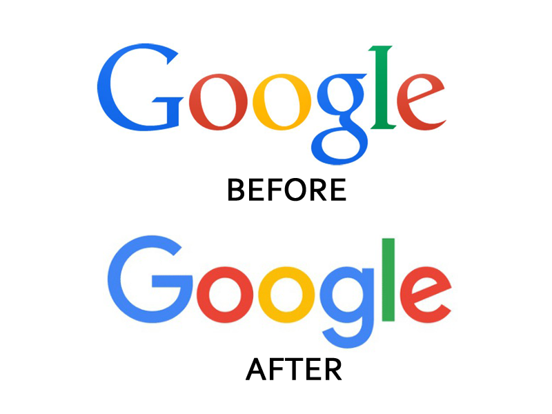
1 | The Almighty Google
Personally, I'm not a huge fan of this. The after feels like an Apple version of the Google logo. Like Google's hipster little brother, trying to be rounded out and cool with a sans-serif font. I take my Google-ing seriously, and the old logo make me feel more like Google did too.
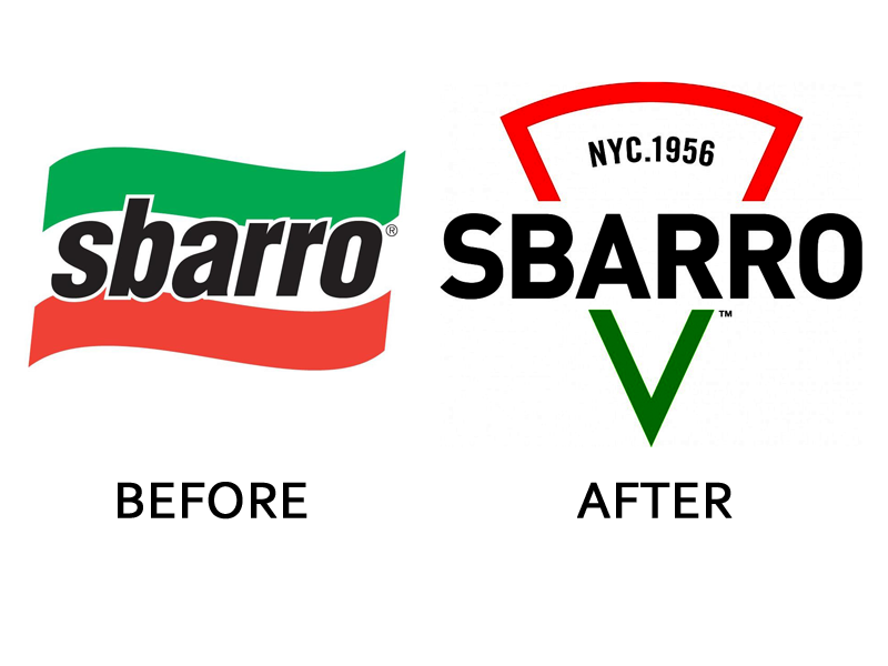
2 | Sbarro and Open Table
I really love both of these. Perhaps it's because I like the literal. Especially when it's done creatively. Sbarro will always be the greasy 3-napkin joint in the mall foodcourt I went to when I was 12 and begged my mom to 'just drop me off' to catch a movie and go to Claire's with my friends. But I never thought I was pronouncing "Sbarro" correctly. Was it "sah-bar-oh" or "suba-row" or some slurred version of the "sb" and "roo"? Confusing. The addition of a triangle in the logo, however, conveys to me that you don't need to know how to say it. It's pizza. And that's all you need to know. For Open Table as well. The new circle with the small circle removed is quite literally a table, with an opening. Simple. Easy. Recognizable.

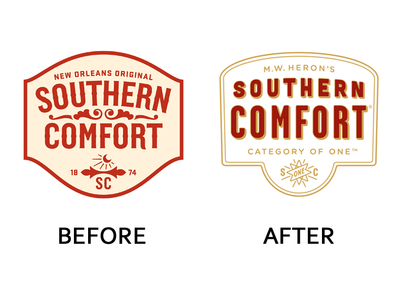
3 | Liquor Branding
I have mixed feelings about these two: Johnnie Walker and Southern Comfort. The Southern Comfort one I like better as there is definitely a trendy-ness in the use of the new fonts and imagery. Both sport new taglines: Keep Walking and Category of One. Yet, neither do I understand without having to do a little brain digging. Obviously, Keep Walking is a play on Walker but what does that imply when you see it in the racks and stacks of hundreds of bottles at the ABC store? Keep walking, this one isn't that good. Drink more, and you can keep walking. Or Steady there Johnnie as you step away from the bottle... keep walking, you're almost to bed. Category of One I suppose is a shorter version of we're in a category all by ourselves and its the best one. But it just seems blah. Overall, the look of both is a bit more simplistic, in a good way. Perhaps these brands are taking a nod from Bourbon Country and trying to freshen things up a bit.

4 | The Old College Try
I've never seen friends so frustrated by logo designs as last year when the University of Kentucky elected to trade in their old UK for a (what I think is not much different and who cares) newer version.

More importantly, here's what I think we can learn from these BIG national brands:
1 | People notice when you change things. Make sure the change you're making is worth the publicity, good or bad. If there's a specific reason you're making a change then, by all means, convey that to your audience. Be transparent.
2 | Subtle changes are better than drastic ones. Drastic changes to your brand identity scare consumers. A customer who has shopped or visited your site for years gets nervous when you go berzirk with branding - is the product going to be the same? is the tone changing? is it the same tried and true they've come to love and adore? The worst thing you can do is alienate your customers by changing the game halfway to the goal line.
3 | When in doubt, get some feedback. After witnessing the branding overhaul at my current employer and the sub-committee for the branding committee (not joking!) that was formed in order to decide which shade of goldish yellow would be least likely to offend alumni, it became clear to me that seeking others advice (although exhausting) is beneficial before making any major changes to your branding.
4 | If you use a tagline, be certain it's something your audience understands, that you don't plan to drop it in a year, and that it works with your brand vision and mission. Simple is always best in logo/brand design so if you can keep that tagline out of your logo - I'd recommend you do it. Save it for a sub-mark or an email signature. If your product is good, you won't need that tagline to speak for you.
What are your thoughts on these 2015 Big Brand Changes? Any others you've seen that are important to note? How have you changed your brand in the last year?