branding and website design for Kindly Kentucky

I was truly excited to work with Laura and Sarah on a new concept for their blog, Kindly Kentucky. These girls have such style, and I knew they'd want me to reflect their classiness, fun, and energy into whatever branding elements and website we created.  We talked very early on in the process about what set them apart from other personal blogs, what they'd like to avoid, and how we could best relay a vibrant and quirky aesthetic to visitors at their site.  I'm truly excited to add Kindly Kentucky to the Redbud Creative portfolio and share Laura and Sarah's new site with the world.  

 
KindlyKentuckyBrandBoard - RedbudCreative.com
 

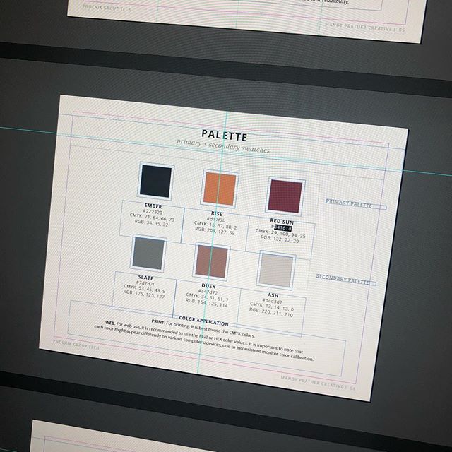
Laura and Sarah's website is focused primarily on their blog, where they offer various different points of entry like recipes, hosting tips, weekend plans, and lots of other fun "southern girl" flair, so I knew early on that these categories would be a key focus of their new design. Their ultimate goal was simple:  "Deliver a fresh and quirky perspective of the Commonwealth to a loyal set of readers."  With that in mind, we began by choosing colors based on a Pinterest board of images the girls created for me.  

KindlyKentuckyColorStory- Redbudcreative.com

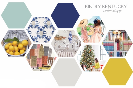
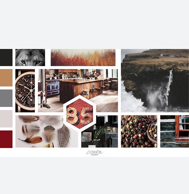
After we narrowed down a color palette, I got to work on logos.  Keeping their key terms (classic, vibrant, fresh, fun, and quirky) in mind.  It helped that I know Sarah and Laura are adventurous and outgoing, and that whatever logo they choose needed to also reflect that image. Logos are one of my favorite things to design and I honestly could have done 40 variations on a theme here, but these are the four I gave them as a starting point: 

 
KKindlyLogosDRAFT1.jpg
 

With the very clear directive that Laura and Sarah did NOT want just another Kentucky state outline as their logo, I had a lot of fun using different "southern" style elements, fonts, and icons to come up with these options.  They selected my favorite, number 1! And also expressed that they really loved the little pineapple, so when I began creating secondary marks for various other purposes, I want to be sure to incorporate that again.  I hope you'll jump over to their new site, KindlyKentucky.com, and check out all that they have to offer!  I think you'll be hooked! 


Are you interested in working with me on a new concept for your brand and website? Please visit the Services page to learn more about all that Mandy Prather Creative can do you for your creative business. Then, get in touch with me via the contact form.  I'm excited to hear from you! 

2015 Big Brand Logo Changes (and what we can learn from them)!

2015 Big Brand Logo Changes - RedbudCreative.com

Happy New Year Friends!  If you're like me, you've got a lot of memories tied to twenty-fifteen.   In the National News it'll be remembered in many different ways: the first year a woman was named head coach of an NFL team, David Letterman's last Late Show, the recreational use and possession of pot becoming legal in our Nation's capitol,  a sad and senseless hate crime in Charleston, SC, the terrorist attacks in Paris, the birth of Princess Charlotte, the legalization of same-sex marriage across all fifty states, and Jimmy Carter's miraculous recovering from cancer. And on, and on, and on... 

On a creative level, both the college I work for and the University everyone in the state cheers for underwent major branding overhauls.  Which got me thinking about other businesses who took the plunge this year and opted for a face lift:  (Cue the Bruce Jenner jokes).  

1 | The Almighty Google

Personally, I'm not a huge fan of this.  The after feels like an Apple version of the Google logo.  Like Google's hipster little brother, trying to be rounded out and cool with a sans-serif font.  I take my Google-ing seriously, and the old logo make me feel more like Google did too. 

GoogleFaceLift - RedBudCreative.com


2 | Sbarro and Open Table

I really love both of these.  Perhaps it's because I like the literal.  Especially when it's done creatively.  Sbarro will always be the greasy 3-napkin joint in the mall foodcourt I went to when I was 12 and begged my mom to 'just drop me off' to catch a movie and go to Claire's with my friends.  But I never thought I was pronouncing "Sbarro" correctly.  Was it "sah-bar-oh" or "suba-row" or some slurred version of the "sb" and "roo"?  Confusing.  The addition of a triangle in the logo, however, conveys to me that you don't need to know how to say it.  It's pizza.  And that's all you need to know.  For Open Table as well.  The new circle with the small circle removed is quite literally a table, with an opening.  Simple.  Easy.  Recognizable. 

Sbarro Logo Example - RedbudCreative.com
OpenTable logo Example - Redbud Creative


3 |  Liquor Branding 

I have mixed feelings about these two:  Johnnie Walker and Southern Comfort.  The Southern Comfort one I like better as there is definitely a trendy-ness in the use of the new fonts and imagery.  Both sport new taglines:  Keep Walking and Category of One.  Yet, neither do I understand without having to do a little brain digging.  Obviously, Keep Walking is a play on Walker but what does that imply when you see it in the racks and stacks of hundreds of bottles at the ABC store?  Keep walking, this one isn't that good.  Drink more, and you can keep walking.  Or Steady there Johnnie as you step away from the bottle... keep walking, you're almost to bed.  Category of One I suppose is a shorter version of we're in a category all by ourselves and its the best one. But it just seems blah.  Overall, the look of both is a bit more simplistic, in a good way. Perhaps these brands are taking a nod from Bourbon Country and trying to freshen things up a bit.  

JohnnieWalkerLogoExample - RedbudCreative.com
SoCoLogoExample - RedbudCreative.com


4 | The Old College Try 

I've never seen friends so frustrated by logo designs as last year when the University of Kentucky elected to trade in their old UK for a (what I think is not much different and who cares) newer version.  

UKLogochanges - RedBudCreative.com

More importantly, here's what I think we can learn from these BIG national brands:

1 |  People notice when you change things. Make sure the change you're making is worth the publicity, good or bad. If there's a specific reason you're making a change then, by all means, convey that to your audience. Be transparent. 

2 | Subtle changes are better than drastic ones.  Drastic changes to your brand identity scare consumers. A customer who has shopped or visited your site for years gets nervous when you go berzirk with branding - is the product going to be the same? is the tone changing? is it the same tried and true they've come to love and adore?  The worst thing you can do is alienate your customers by changing the game halfway to the goal line.

3 | When in doubt, get some feedback.  After witnessing the branding overhaul at my current employer and the sub-committee for the branding committee (not joking!) that was formed in order to decide which shade of goldish yellow would be least likely to offend alumni, it became clear to me that seeking others advice (although exhausting) is beneficial before making any major changes to your branding.

4 | If you use a tagline, be certain it's something your audience understands, that you don't plan to drop it in a year, and that it works with your brand vision and mission.    Simple is always best in logo/brand design so if you can keep that tagline out of your logo - I'd recommend you do it. Save it for a sub-mark or an email signature.  If your product is good, you won't need that tagline to speak for you.


What are your thoughts on these 2015 Big Brand Changes?  Any others you've seen that are important to note?  How have you changed your brand in the last year?